Case Study/Design Sprint: Pastel Bank
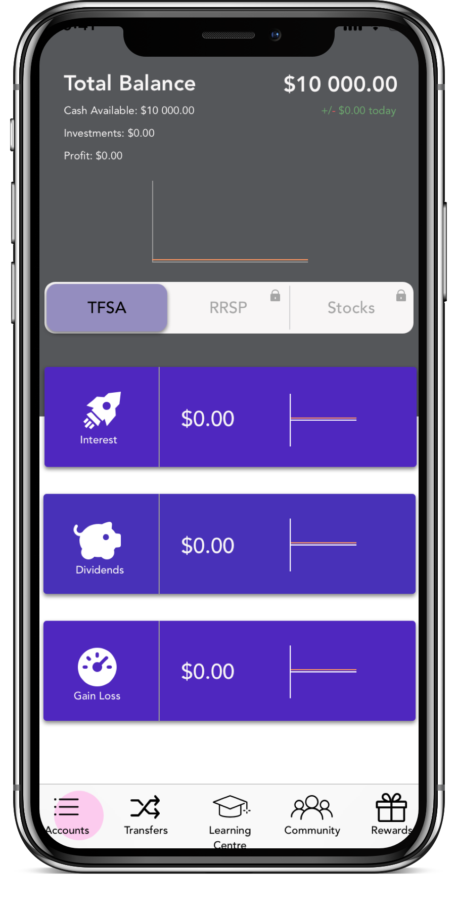
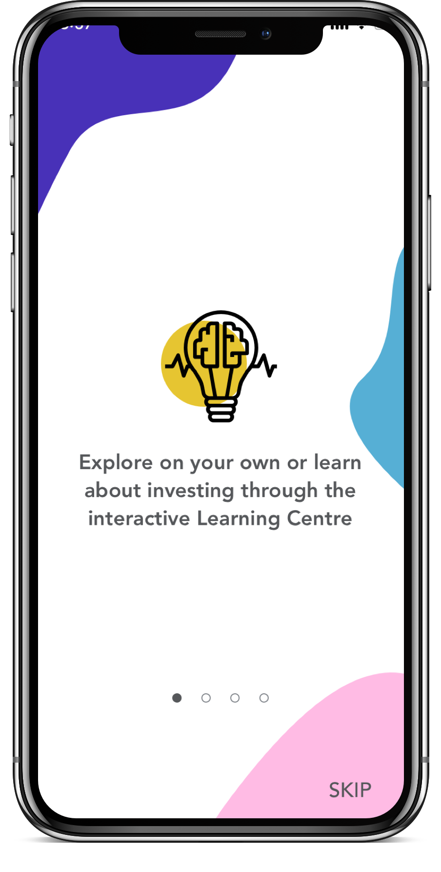
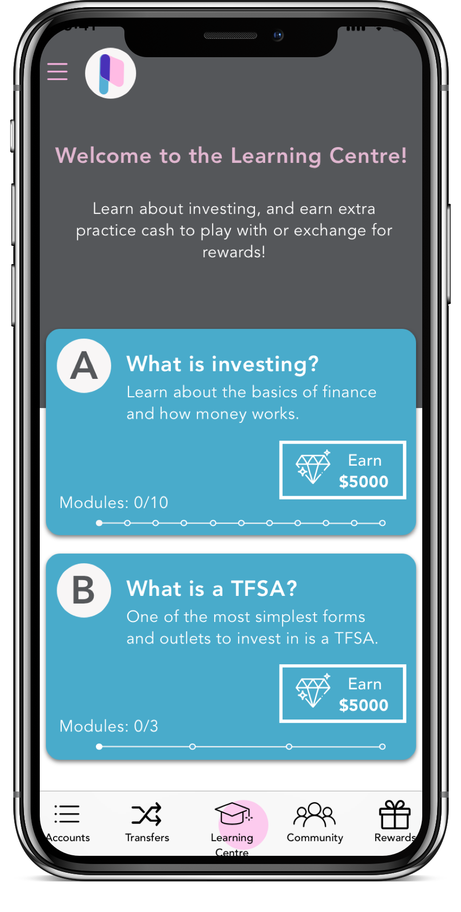
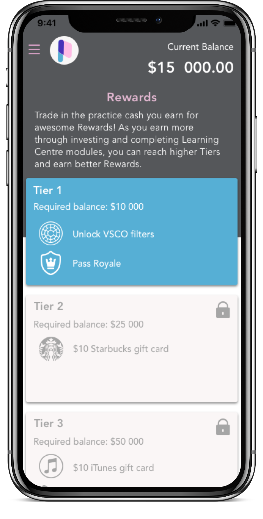
A collaborative academic design sprint with Scotiabank’s Digital Factory. My team and I designed a practice investment portfolio for teens to learn about investing, earn rewards, and further their ability to be financially independent.
The Client
Pastel Bank is a friendly and approachable brand, with the primary goal as a business to demystify the complexity of the many elements of saving, spending and investing money. Pastel Bank currently offers typical personal banking services through a responsive website to manage chequing, savings and credit card accounts.
Deliverables
Create one distinct task for a native mobile app, created for one target customer of choice
A marketing desktop website (pre-login screen) demonstrating how customers will learn about the new mobile app offering
Project Constraints
Branding Requirements:
Must be designed using Avenir as the primary font
Needs to be WCAG AA Compliant
Must reflect the primary brand colours
Technical Requirements:
Accounts are associated with a Client ID # (8-digit number)
Displayed balances must support up to 11 digits (ie. $999,999,999.99)
Minimum required account types: Chequing, Savings, Credit
Transferring between Patel Bank customers is free, while e-Transfers charge $1 per transaction between institutes
Signing up must be prioritized over signing in
Target Customer
Problem Space
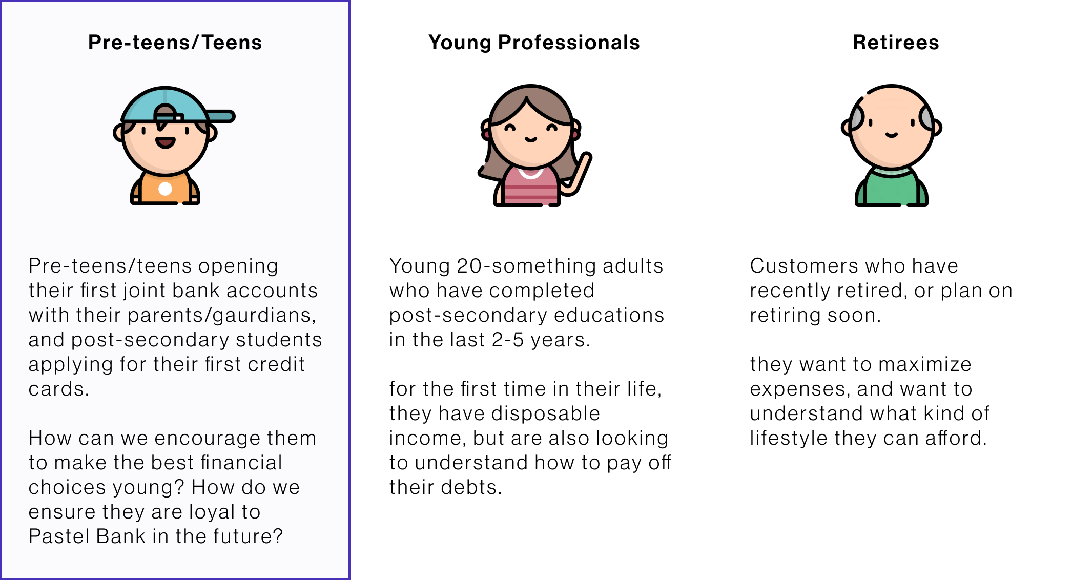
A problem space we thought about for pre-teens/teens is the importance of educating youth to learn about setting themselves up financially for their future. Many youth don’t know where to look for reliable information, especially in today’s age where there is a plethora of information.
Secondary Research Insights
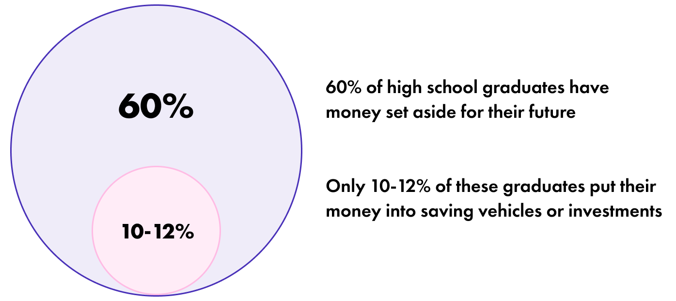
Today’s youth is tomorrow’s lucrative client base — instilling children with strong financial values can help them better prepare to save for their future and develop financial independence.
Experience Map
User Research Insights
Persona
Solution Concept
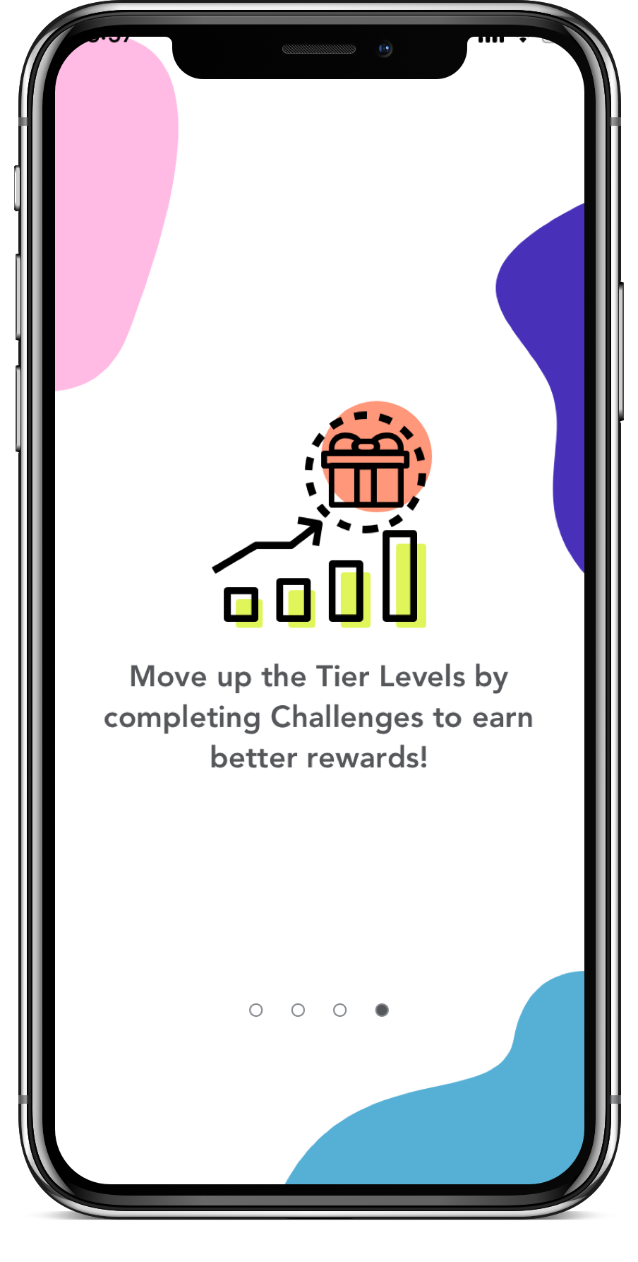
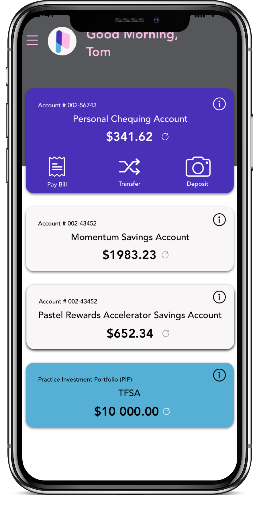
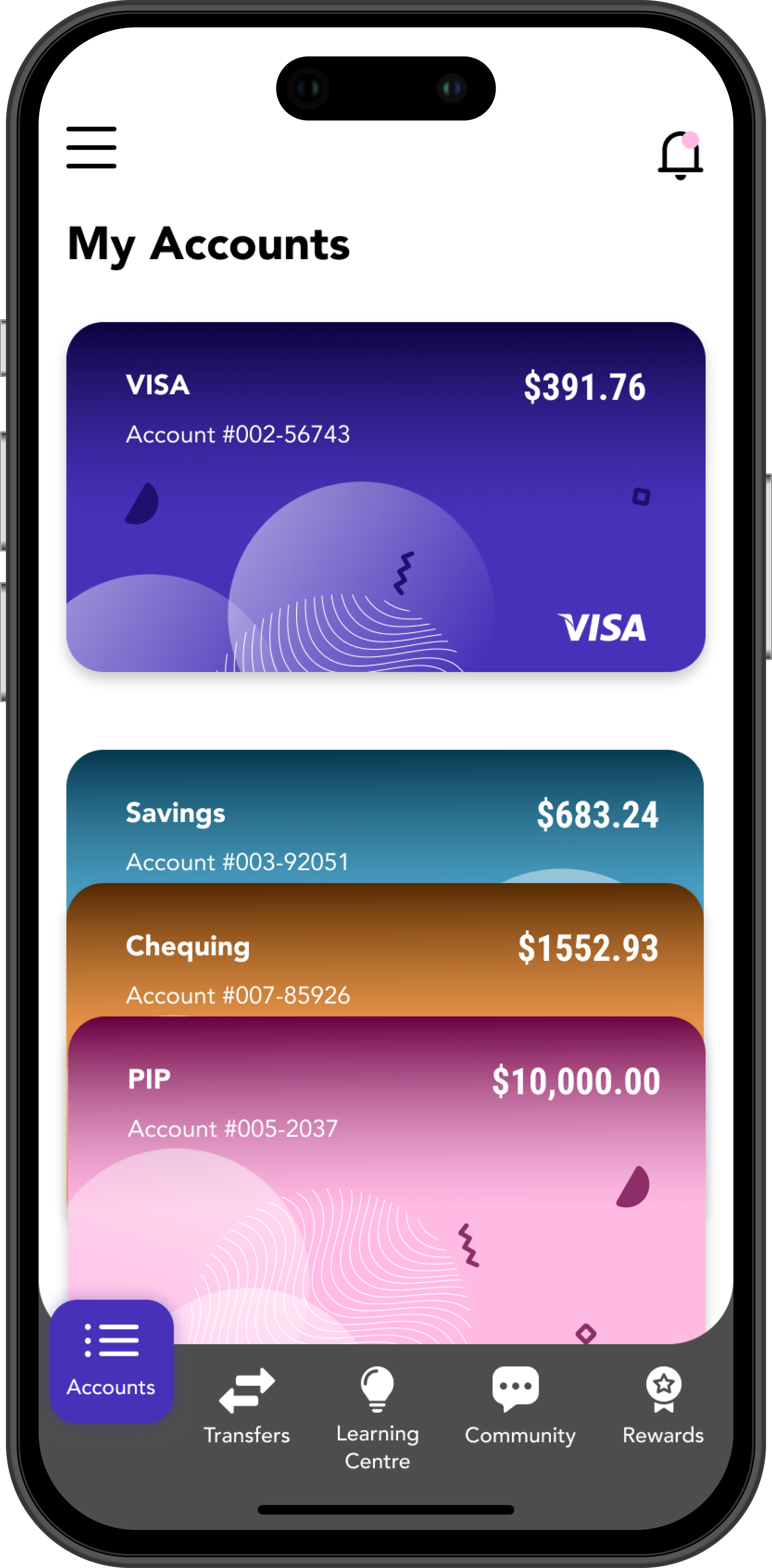
A Practice Investment Portfolio (PIP) linked to the user’s bank account. Pre-teens/teens can take this opportunity to learn about investing and earn real-life rewards. We wanted to engage youths’ interest in investing, so they can better prepare for their future. We believe that for Pastel Bank, targeting youths’ needs now will help enhance their intrinsic motivations to want to continue their services with our bank in the long run. Showing that you care about them while they’re young, will help build trust and empathy with the brand in the future.
Business Goals
Create Loyalty
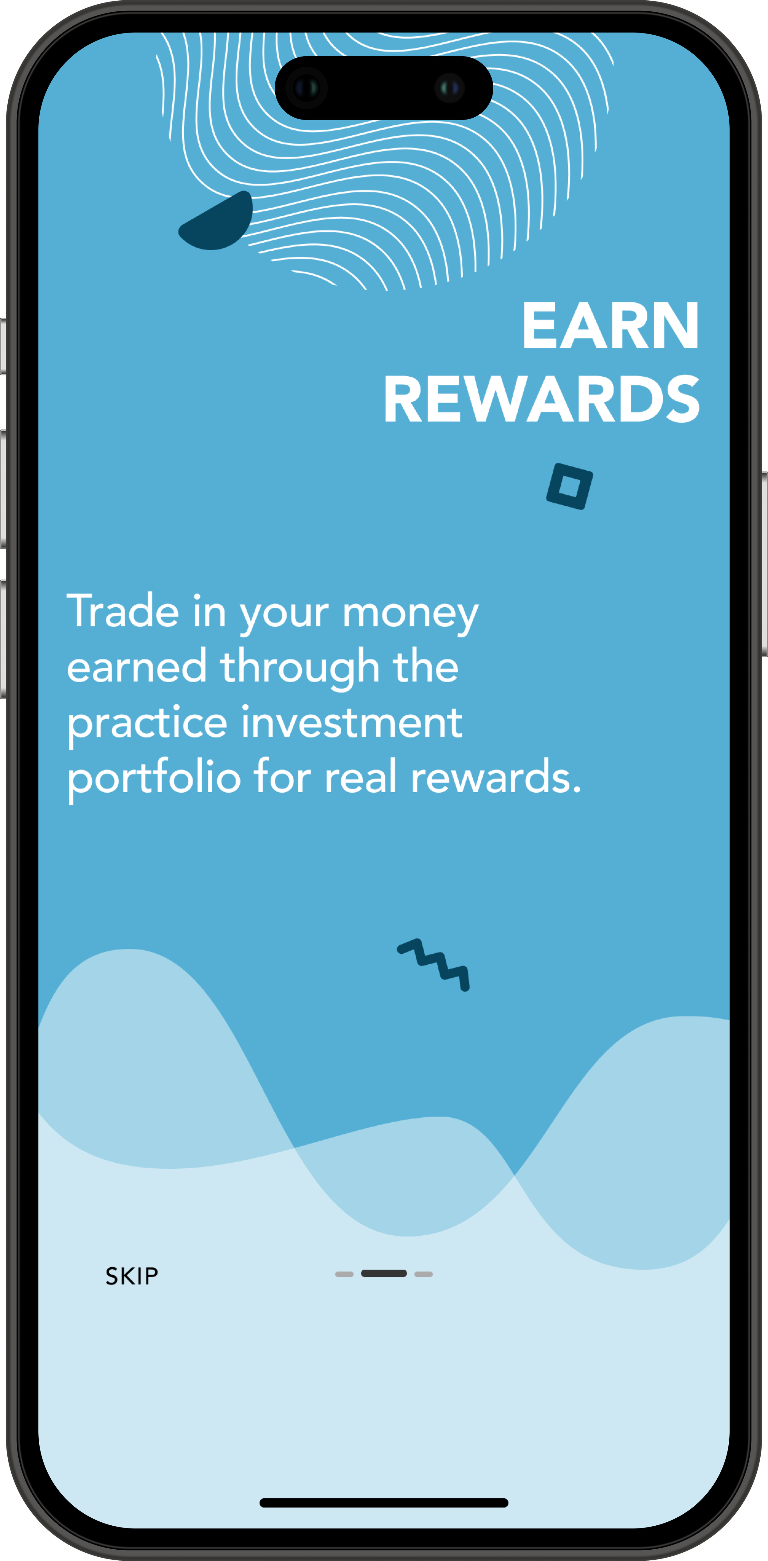
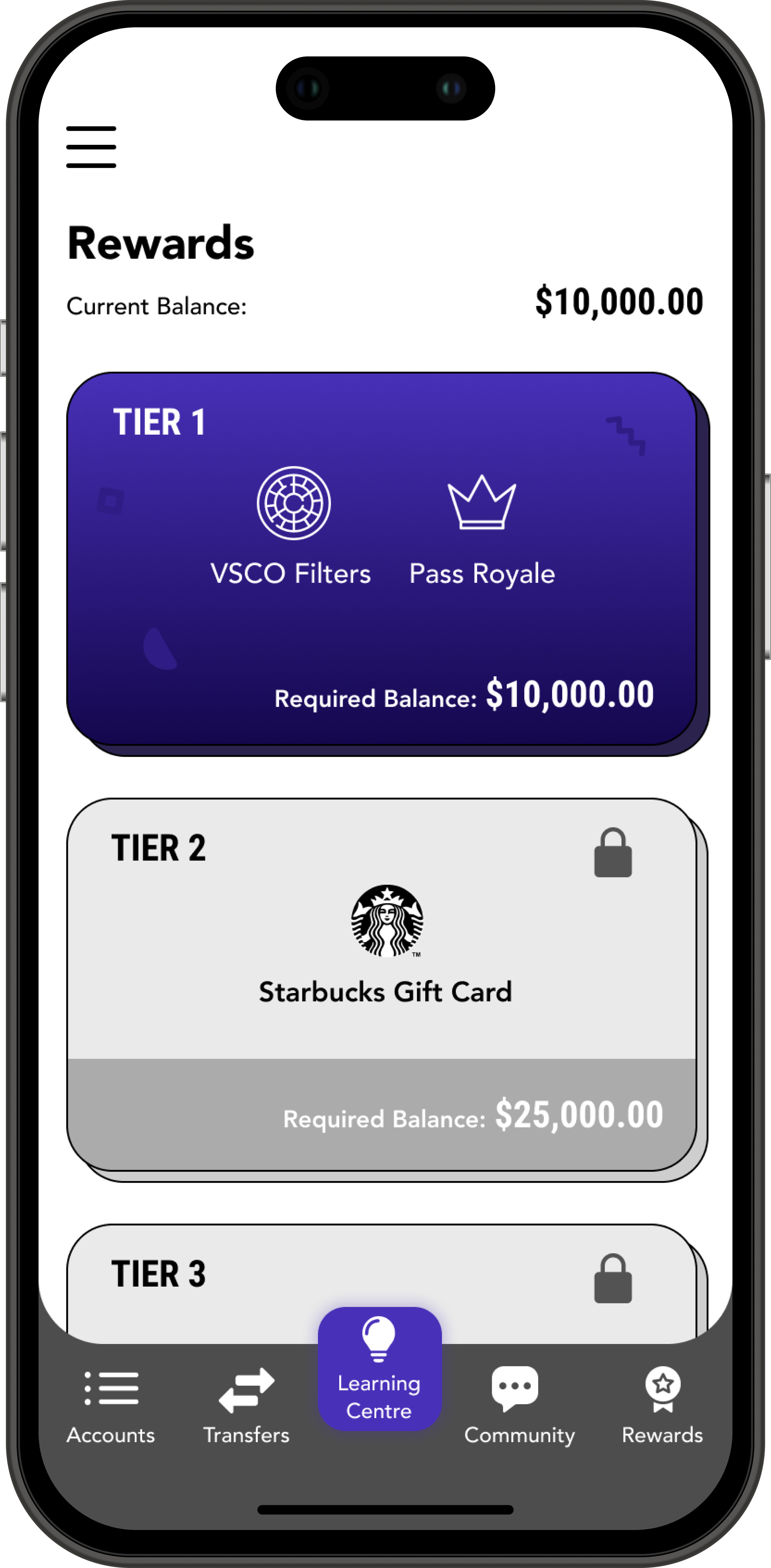
One of the business goals we wanted to achieve, was building a relationship with the youth to build loyalty towards Pastel Bank. The idea is that the PIP platform will be similar to the real Pastel Bank Investment platform. This will provide an easier transition when users have the capability to actually start investing. We would also like to offer a $300 investment reward earned by reaching the last Reward Tier on the Practice Investment Portfolio — this will go towards their Pastel Investment account, allowing the business to continue this relationship with the client into adulthood.
Investing in the Next Generation
We want to create an environment where teens and youth feel cared for — investing in teens early on to understanding financial literacy will distinguish Pastel Bank from its competitors. Being friendly and approachable as a brand, as well as “putting customers first”, will allow teens and youth to empathize for the brand in the long run.
Storyboard Journey
Visual Research & Logo
User Testing Output
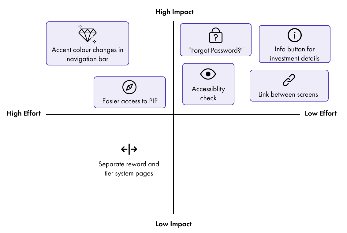
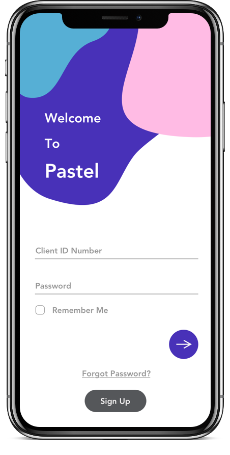
After creating our prototype, we conducted a user testing to test the functionality and flow of the app. A key finding we had to immediately change was making sure all buttons and text were the appropriate size for a mobile application to be legible and easily clickable. Users also mentioned that some screens had a lot of text which they would probably end up skipping because it felt overwhelming. During some steps of the flow, despite being able to overcome it on their own, users felt confusion about some of the information presented. Finally, some small details were missing that we overlooked, like the “Forgot Password?” link during sign in which is important to help users recognize, diagnose and recover from issues.
Based on user testing, we came up with a high impact low effort quadrant to identify important changes to make for our final product. Items boxed are the ones we proceeded to make changes for the final iteration:
Pastel Bank: Practice Investment Portfolio
Stakeholder Presentation Feedback
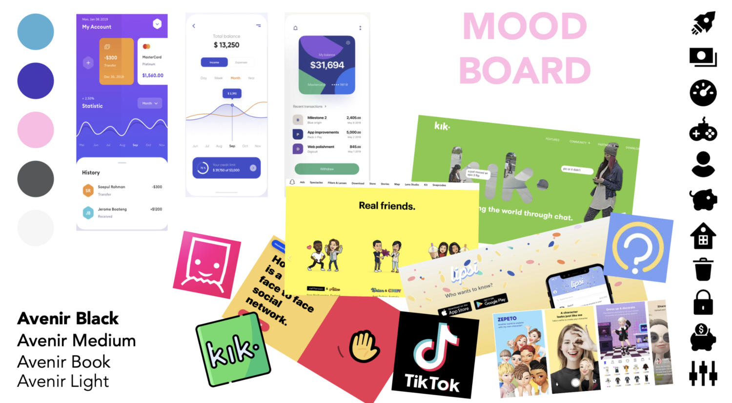
We presented our work to the executive team at Scotiabank Digital Factory and part of their feedback was that they loved our visual research but did not see it well represented in our designs. They suggested that we incorporate more of that fun, teen style into our designs while still maintaining a professional bank style. With that feedback in mind, I did a personal visual redesign of the project after the sprint.
Key Learnings
I was really lucky to have been put into a group of diverse individuals and we were able to identify each other’s strengths and weaknesses early on. It so happened that our team’s strengths and weaknesses really complemented with one another, which helped us a lot throughout the entire sprint with dividing responsibilities. This was the first design sprint I ever did, and I had to trust the process and trust my teammates because there was no time for any doubts. There were times when our team would focus too much on fine details causing us to lose track of time. There is no room for perfectionism - it’s important to judge where to invest time, how long to try, and when to switch to a new solution. Therefore in order to combat losing track of time in the future, I can set a timer to notify the team to wrap up and move on when the time is up. This not only keeps myself aware and organized, it can also help keep the entire team on schedule.


