Case Study/Heuristic Evaluation: Pizza Nova
The purpose of this project was to conduct a heuristic evaluation and assess a designed interface for compliance against Jakob Nielsen’s 10 general principles for interaction design.
About Pizza Nova
Pizza Nova is a Canadian franchise chain of pizza restaurants. The chain was founded in 1963 and launched the Pizza Nova App in 2014, which was available on both the Apple App Store and Google Play Store. The app was created to allow consumers to quickly and easily place orders directly on their smartphones.
Design Challenge
As a team, we conducted a heuristic evaluation on the Pizza Nova App on Android. A heuristic evaluation is an inspection method that helps identify problems in the user interface design. Following the evaluation, we also implemented the recommendations by redesigning the screens and keeping the original UI elements of the app.
Current Mobile User Experience
According to the reviews left by users, the overall experience of using the app is very poor. Many users state that they love the pizza, however the usability of the app is terrible leaving consumers confused and frustrated. Some of the reviews gathered in March 2020 are highlighted below to further support for an app redesign:
Heuristic Evaluation
What is it and how did we do it?
A heuristic evaluation is a process that measures the usability of a user interface design. We followed Jakob Nielsen’s 10 general principles for interaction design, revealing insights that can enhance product usability. Three main factors taken into consideration during the evaluation was the frequency, impact and persistence. We gave it a score on a scale from 0 to 4, 0 being no usability problems and 4 being issues that are imperative to fix.
User Task Flow
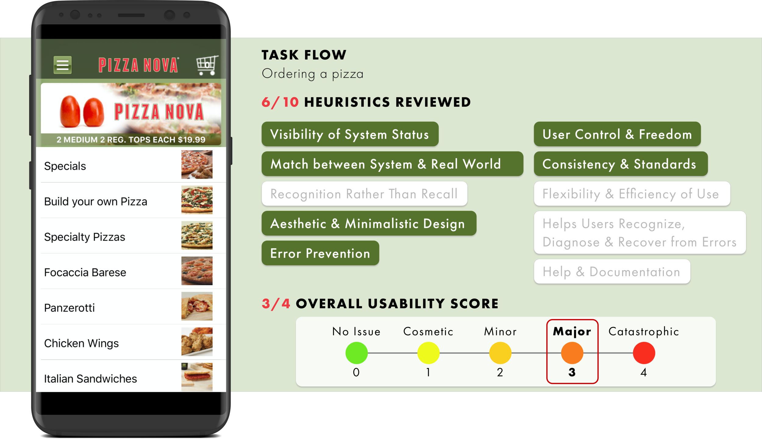
The Pizza Nova App was created to allow customers quick and easy access to ordering pizza. Users are able to view the entire menu, locate stores, save their favourite orders, place future orders and much more at the convenience of their smartphones. Therefore, for this heuristic evaluation, we chose the main task flow of ordering a pizza.
Evaluation Summary
An overall usability score of 3 out of 4 was determined, indicating that major usability issues exist in the Pizza Nova App. Below is the summary of the evaluation and usability recommendations:
Full Evaluation & Redesign
Upon going through the task flow of ordering a pizza, here are the following usability issues and recommendations we established, as well as redesigns for those specific digital screens. Since we were not redesigning the entire app’s interface, we used the same elements and typography as the original, and simply made alterations that we believe will make the usability better.
UI Library
All UI elements and components were recreated by my team to replicate the current Pizza Nova App as closely as possible.
Next Steps
We had a short timeline of 2 weeks to complete this heuristic evaluation and we chose violations that were the most prominent to redesign. In order to provide a better overall experience of using the Pizza Nova App, doing heuristic evaluations on other task flows or even reviewing the same task flow, will bring to light other heuristic violations that we did not touch upon. It is also important to conduct usability testing on the new redesigns to evaluate if the designs improve usability or if further refinement is necessary.
If the budget permits, our team would recommend updating the interface design of the entire app to one that is influenced by UI trends today. Reasons why we believe this is beneficial is because an outdated interface will adversely affect user confidence and push them to more modern competitor applications. We can take this opportunity to correct any previous errors, optimize graphics and simplify in-app navigation to better the user experience.
Key Learnings
Redesign Approaches
Working in a team made me realize that each of us might have a different approach at redesigning a specific screen. Laying out our different perspectives allows for team discussions, and choosing the one we can agree is best for the user experience.
User Reviews
Without conducting any user interviews, we were able to gather a lot of information under the reviews section on both the App Store and Google Play Store. These are real users who are expressing their opinion on the app, and based on the average rating of the Pizza Nova App in both stores, it gave a clear indication to us that a redesign was necessary.
Design System
I learned the importance of a UI library, as it helps save time and also provides consistency throughout the design of an interface. Having a design system, allows designers to focus on improving the experience, rather than spending time recreating the various elements and components.


