Pepper Esports
PROJECT DESCRIPTION
An esports tournament hosting platform that brings the thrill of continuous competition to everyday gamers. Our goal is to provide them with the same high-quality experience they've grown accustomed to from in-person live events.
The goal of this project was to implement multiple registration methods for users to sign-up for esports tournaments. The business goal is to improve conversion and customer retention. Within this project I explored and created multiple solutions that was then developed and measured for project success.
PROJECT TYPE Product Design
DURATION 8 weeks
RESPONSIBILITIES Information Architecture, User Flows, Wireframing, UI design, Prototyping
PLATFORM DESIGNED Desktop, Mobile
STATUS: Developed in 2022
Research & User Flow
While there was traffic on Pepper's website, there was a low conversion rate in terms of users registering for tournaments. I initiated an investigation into the user journey for tournament registration to pinpoint areas for improvement and enhance this process.
Areas of Opportunity
Users who were not already logged into an account were able to browse available tournaments, but the register CTA was only available for those logged in — this created a barrier and made it more difficult for users to register for tournaments
Users lacked the ability to register for multiple tournaments simultaneously, which meant that if they wanted to register for more than one tournament, they had to go through the registration process separately for each tournament
While there was traffic on Pepper's website, there was a low conversion rate in terms of users registering for tournaments and participant engagement in the tournaments
User Flow Solution
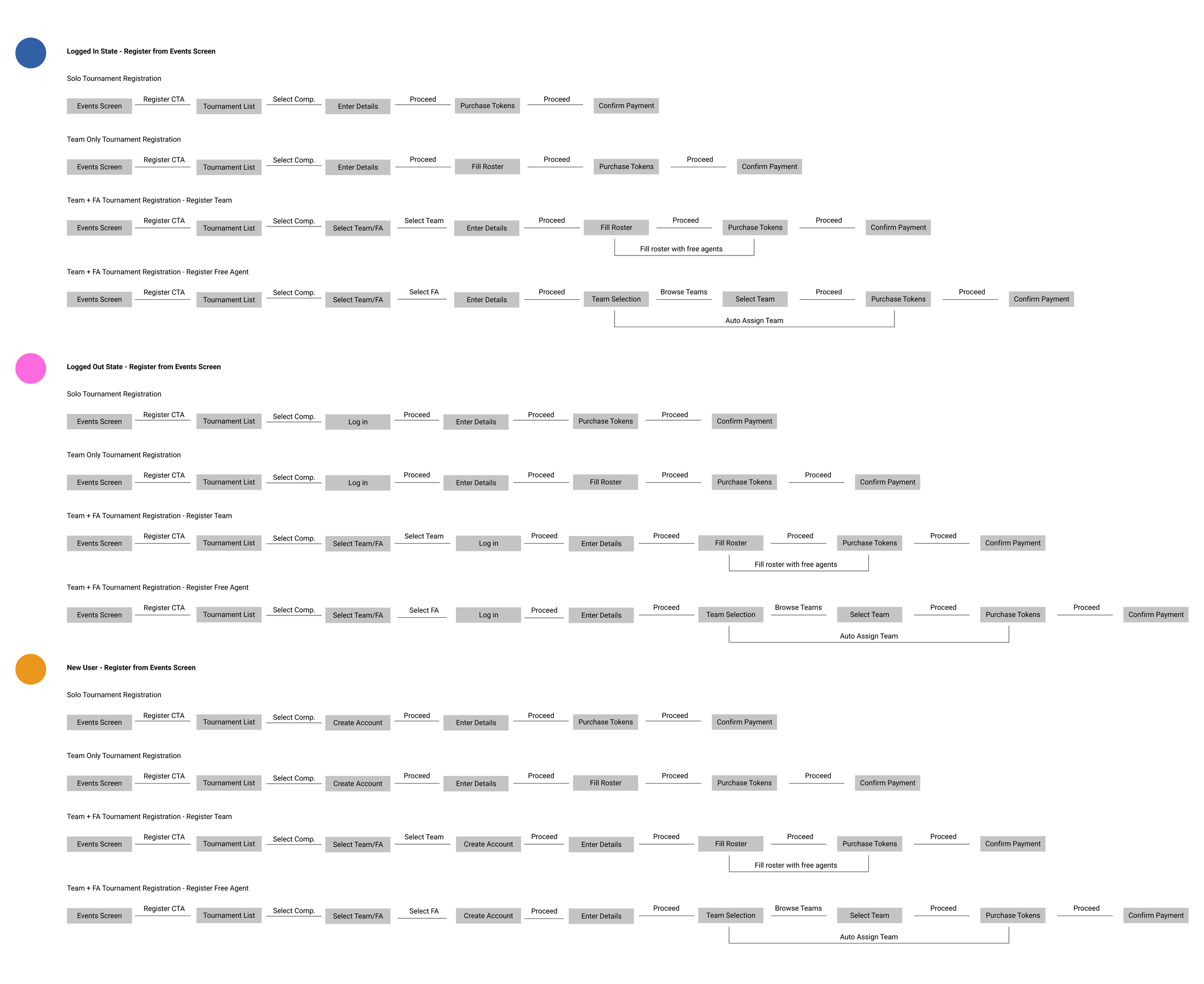
I initiated an investigation into the user journey for registration to pinpoint areas for improvement and enhance this process. While adding a CTA may seem like a minor change, it is crucial to recognize that for a tournament hosting platform, participant engagement for these tournaments is a very important factor for success on this platform. This directly influences the platform’s viability and serves as a primary driver for activity and revenue generation. Here a number of user flows were generated for different states and available registration screens — logged in vs logged out vs new user, and from the tournament page vs event page.
Solutions Highlight
For the tournament pages, we added a fixed register CTA at the bottom of the screen
For the event pages, we added a register button under the event name
By adding in appropriate CTAs we are able to enhance the user experience and drive desired user actions, as we are able to help users navigate through the website more efficiently, guiding them towards key actions
Leveraging our AI capabilities, we created an opportunity for users to register for multiple tournaments at once by generating a page during their registration process with personalized recommendations that is relevant and likely to be of interest (previously browsed tournaments and other tournaments with similar game play)
Final Designs
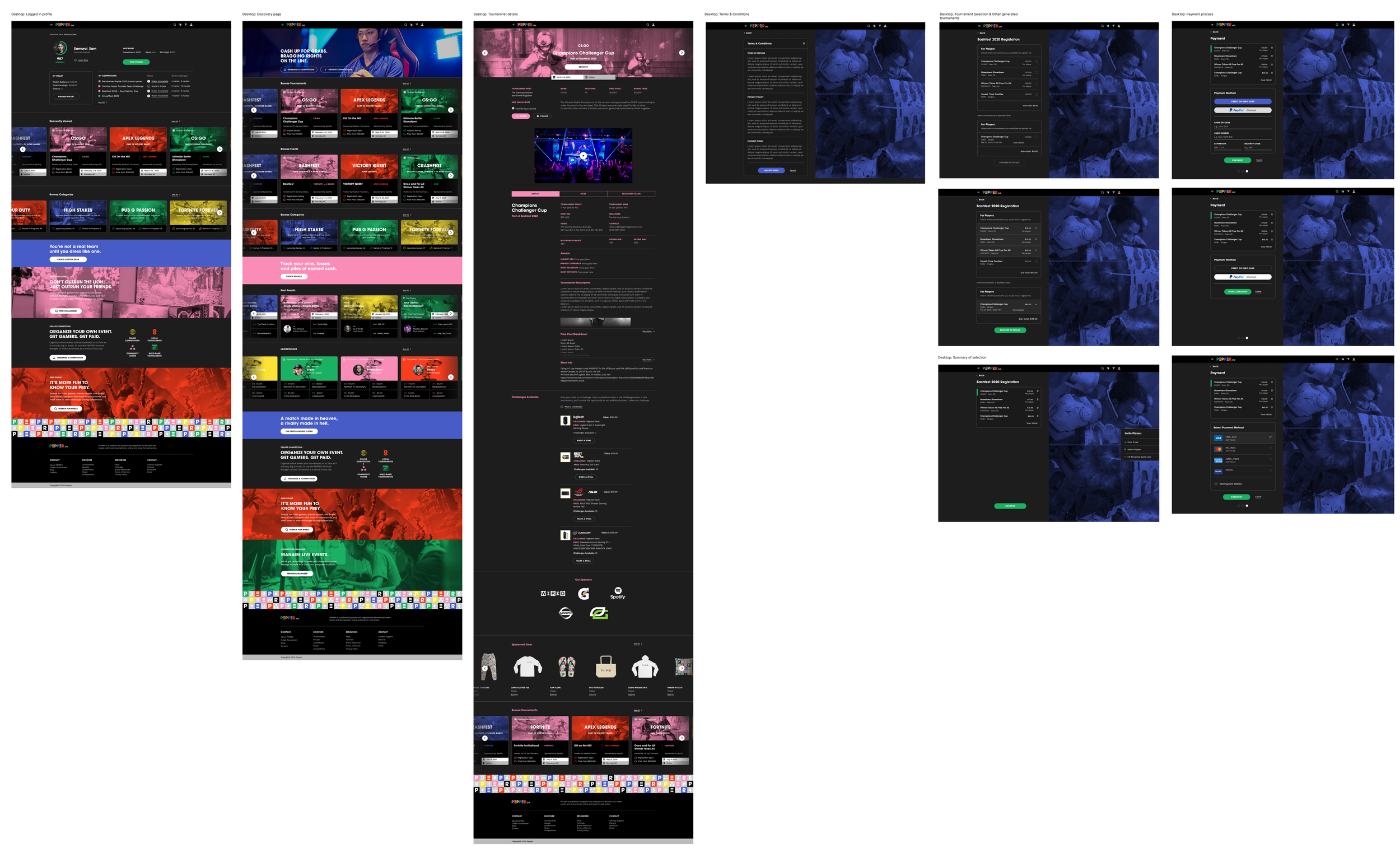
Given the large amount of screens created for these flows, only one set of screens for the mockup and final design will be shown.
Talking Data
Data is one of the key success indicators. I find it rewarding to leverage data in shaping design decisions (albeit with some caution as it may not always be optimal) and observing how these designs resonate with our users. After implementing these features for six months, here are some notable data highlights. After 6 months, here are some highlights:
Registration conversion rate 25%
Average event attendance/participation increased by 30%
Key Learning
Small changes, big impact
By optimizing the registration flow and reducing unnecessary steps or fields, even small adjustments can lead to significant improvements in conversion rates. In this scenario a missing CTA button caused users to turn away from the platform without registering for tournaments. With the data collected it shows a difference a simple button placement creates. Making subtle changes to the placement of CTA buttons — positioning them prominently on the events screen, can draw users' attention and prompt them to take action.


